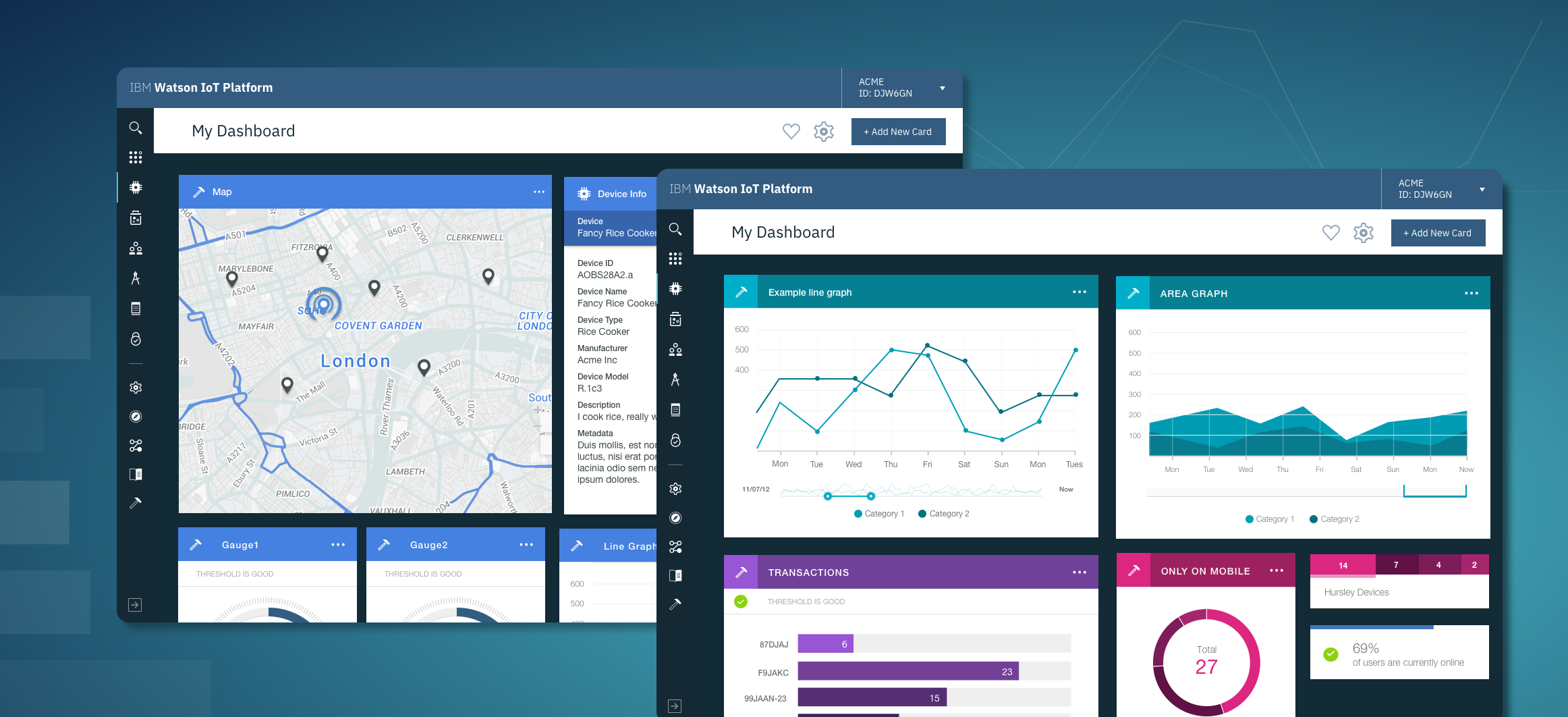
Watson IoT Platform Dashboard
Making it easy to connect thousands of devices for your organisation and have them stream their sensor data in real time. Where are they, what is their temperature, humidity, speed and more.
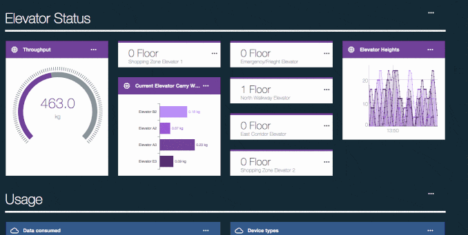
The Dashboard serves to help you immediately visualise and contextualise the data you are getting from your devices, no matter what they are. It also allows you to keep track and on top of your organisation in respect to your IoT effort in general.
The challenge
"How do we create a dashboarding system that can allow users to get meaningful insight no matter their situation and context? And more importantly it acts as an inspiration point for any app developer building on top of our platform?"
0. Gathering Requirements, Benchmarks & User Expectation:
For this, the team and I made use of intercoms Job Stories as an approach:
1.
When I'm comfortable that my devices are online and publishing data, I want to get some contextual understanding of the state of those devices in a visual format, so I can start understanding and acting on that data.
(Visualisation)
2.
When the Platform has released a new set of capabilities, I want to be able to see some of the actionable results of using those capabilities before going in to set them up myself, so that I can have an image of what I'm working towards in my mind as I try out those capabilities.
(Understanding)
3.
When I'm starting out on building my own IoT Application on top of the IoT Platform, I want to get an idea of what kinds of things I can do with my output data and how I might be able to visualise it, so that I can take lessons learned rapidly into my own work.
(Inspiration)
4.
When I'm demonstrating the power of the IoT Platform to potential clients, I want to tell them a story of business value using the data in front of us without too much clicking around, so that I can garner good will towards us through showing how valuable our work is.
(Selling)
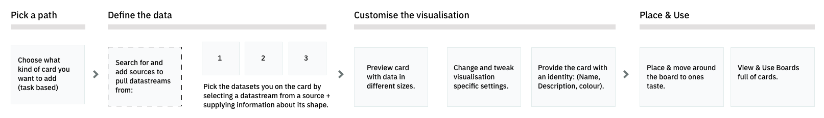
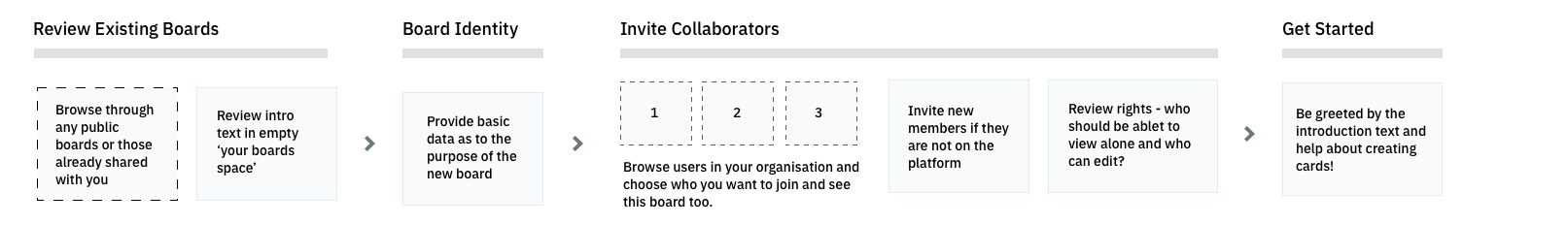
1. In Depth of Tackling the Problem: Card Creation Experience
So we need something that is flexible, more around building your own dashboard to tell a specific story and exploring the opportunities.
1.1 Gaining understanding & gathering requirements.
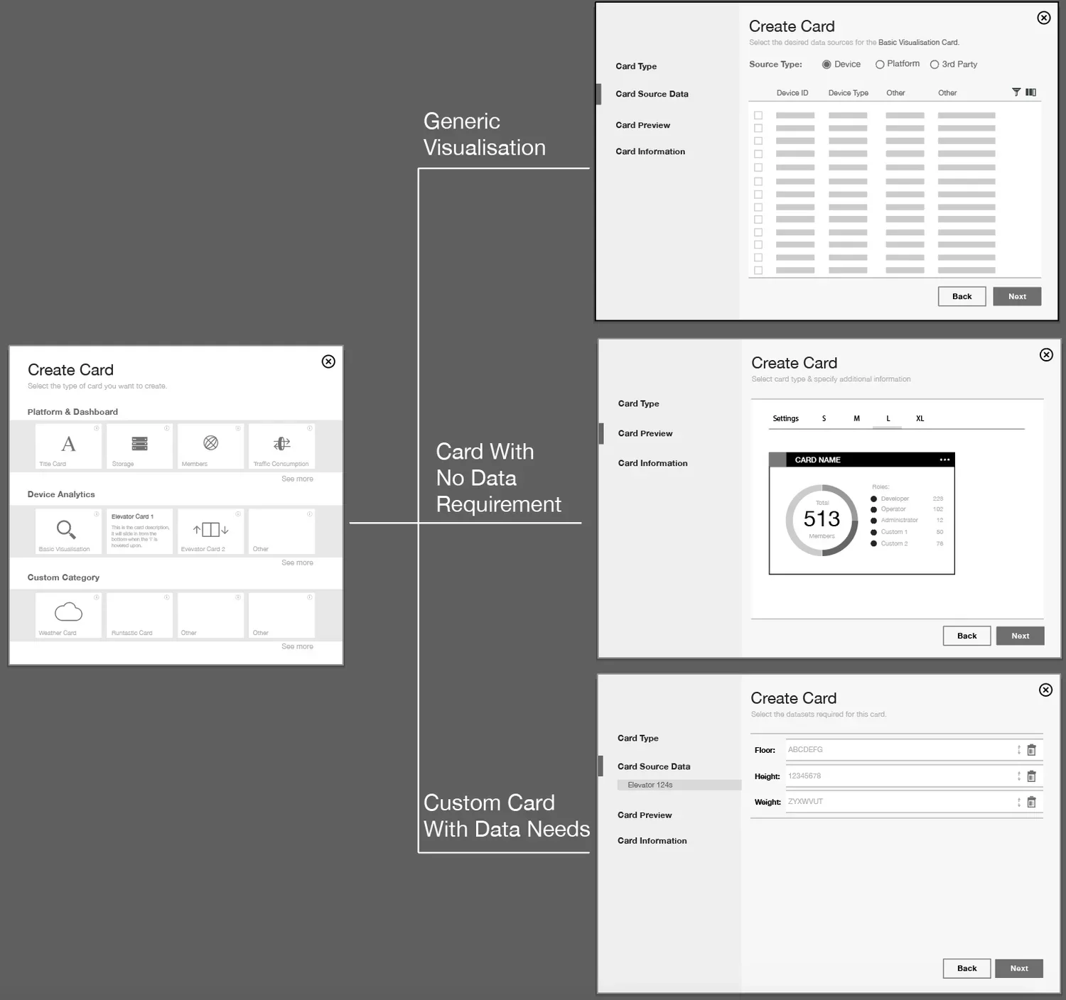
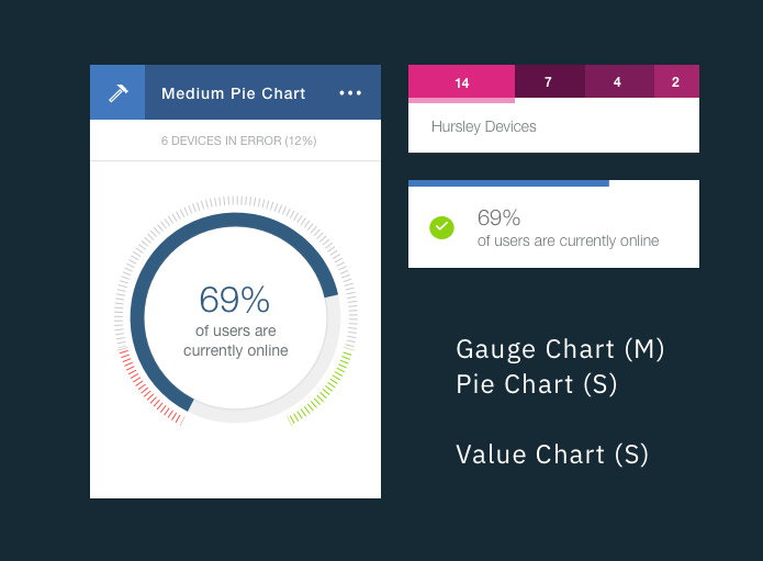
Understanding of whats kind of 'cards' actually exist on a dashboard and what steps a user will likely need to fill out, resulted in 3 'breeds'
| Type | Generic (eg. anything) |
Specific but no data requirements (eg. alert) |
Specific with specific needs (e.g. custom visualisation) |
|---|---|---|---|
| Input | Give me any data you have | Don’t give me any data(skip this step) | Give me the data I asked for(floor, height, weight) |
| Preview text | Ok now here's how that looks on these robust but basic charts change the colour and name it. | Ok this is what is looks like you can change the color and give it a name. | You gave me data I need, now these are the different ways I can show you the status of your car. |
| Output | Piechart/bar/linegraph | Whatever was coded (could even just be a webpage) | Specialised visualisation of chosen data (say of a vehicle) |
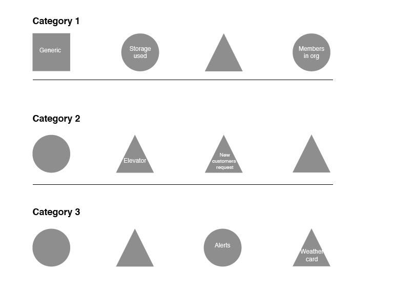
1.2 Gallery Logic:
Square = Generic visualisation Card.
Circle = Specific visualisation card with no requirements on the user (hardcoded data).
Triangle = Card built to achieve a specialised visualisation and in need of specialised data.
Great, so now we know that depending on what card they pick, they are going to be treated to a slightly different experience in order to get to the end result. So that gallery view they are greeted with will likely look more like this (to the right) if we were looking at it based on experiences.
That however isn't how users are likely to be approaching their issue - no ones going to pick one card over another to view their data based on the kind of experience it is to create them. Its the kind of data they are looking to achieve with this board based on their job role (HR, Data analyst, System admin etc) that is going to help them far more.
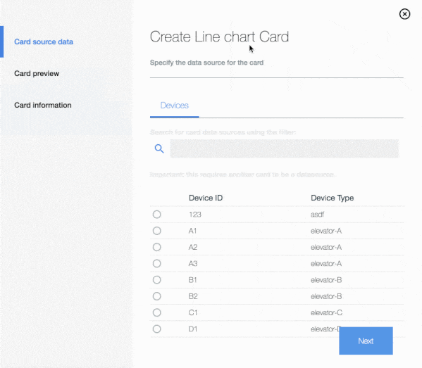
1.3 Defining the data:
ABC
1.4 Previewing your card and giving it an identity:
ABC
1.5 The Experience
2. Using & Interacting with the cards on a board
Material Interaction - These are 'cards' floating on a perfectly still surface. Users can move them, resize them and remove them effortlessly.
Derived by user expectation gathering, understanding that dashboarding is a deeply 'red ocean' place in the world, with everybody rarely innovating, but rather tweaking a number of deeply entrenched patterns that have made their way into user expectation.
Arranging your board & resizing your cards
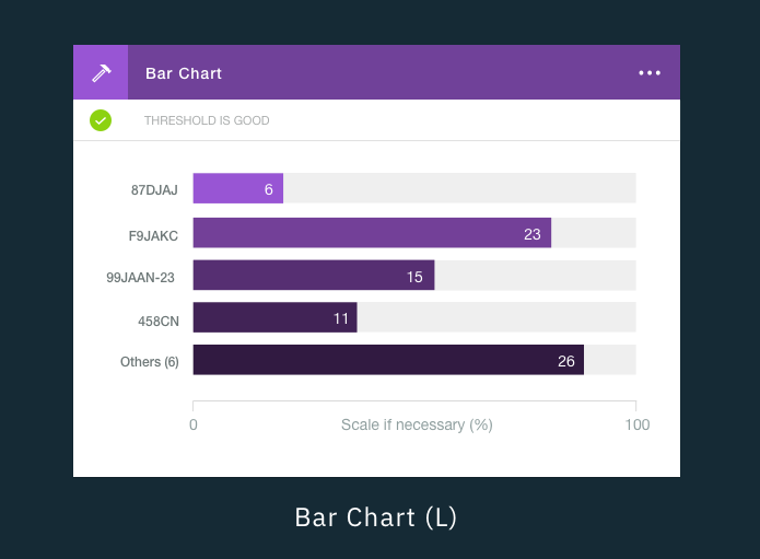
Starter card set
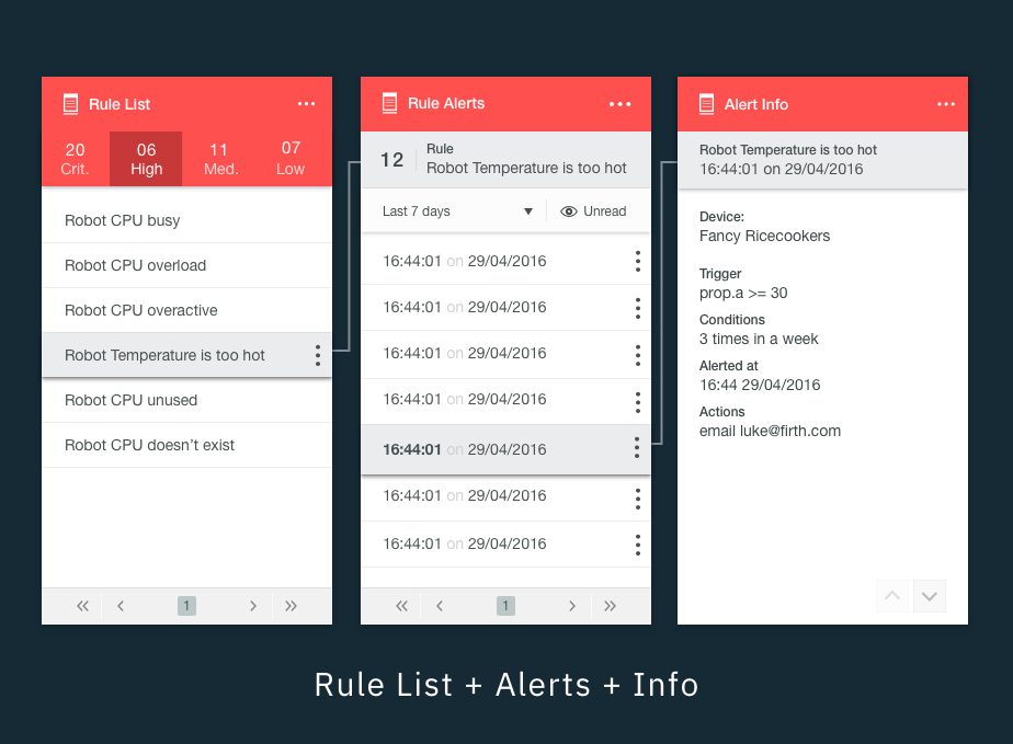
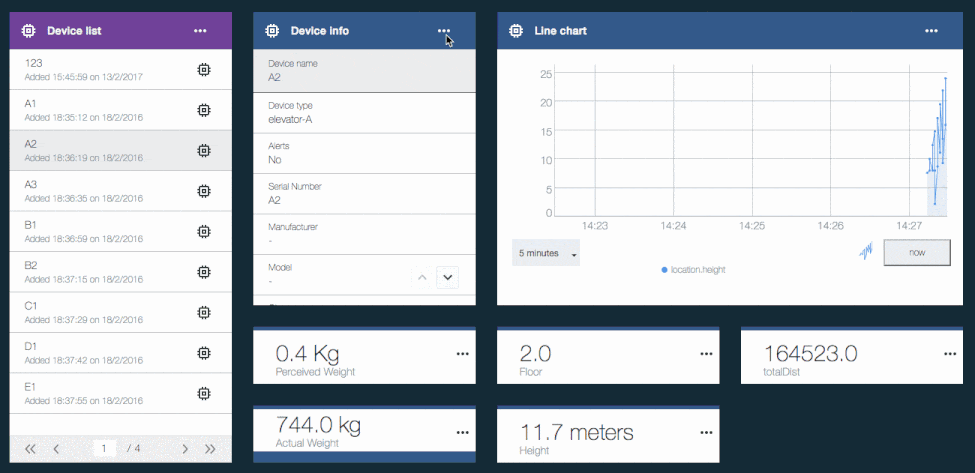
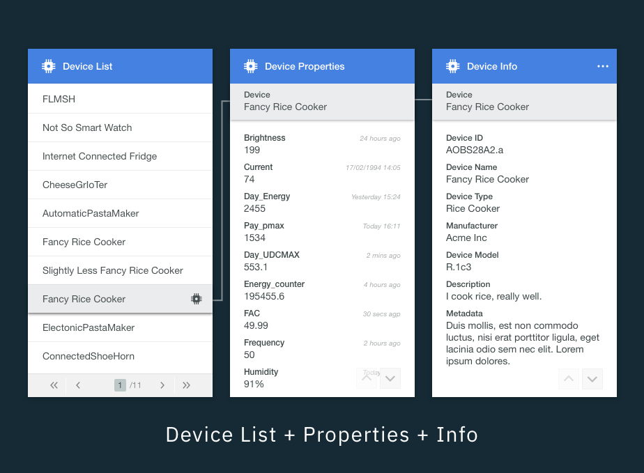
Cards Talking to Cards
3. Board Management, Creation & Collaboration
WIP Using and laying out a dashboard is something that is met by…..
4. In Review & Staying on the right track
Was it successful?
Do people even like it? - Does anyone even use it?
The Forrester Wave™: IoT Software Platforms, Q4 2016 - IBM named a leader in IoT software platforms
Why was it successful?
It knows what it is - not an all singing all dancing Dashboard
A simple toolbox, handing some of the success to you as a user while guiding you with examples.
Exstensibility (Custom Cards Hotplug)